Make credit boring.
CRNCH is an iOS app for people carrying credit card balances. Every morning it answers one question: what can I safely spend today? I took it from idea to the App Store on my own: the product, the brand, the design system and the code, working alongside AI coding agents.
- My role
- Founder. Product, brand, design system and React Native code.
- Platform
- iOS. Launched [NEED: month and year].
- Tools
- Figma, React Native, Claude Code, Cursor. [NEED: confirm]
Credit apps show you everything. That's the problem.
If you carry balances on a few cards, you already have more data than you can use. Every bank app shows balances, statements, minimums, due dates and rewards, each in its own place. None of them answers the question you actually wake up with: can I buy this today without making things worse?
More charts don't help someone who is anxious about money. One clear decision does. [NEED: one line on where the idea came from. Your own experience, people you talked to, or both?]
One number, then two small decisions.
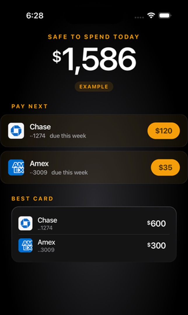
The home screen leads with one thing: safe to spend today. Under it sit the only two other decisions that matter that week: which card to pay next, and which card to use. Everything else is a tap away, not on the front page.
That is a craft rule I use everywhere, including the design-system work in my other case studies: a screen leads with one thing, and structure does the work before colour does. In a money app it matters more, because every extra number is another thing to worry about.
Twelve screens became seven.
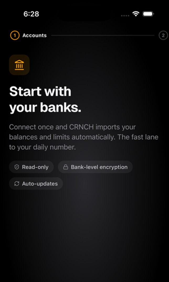
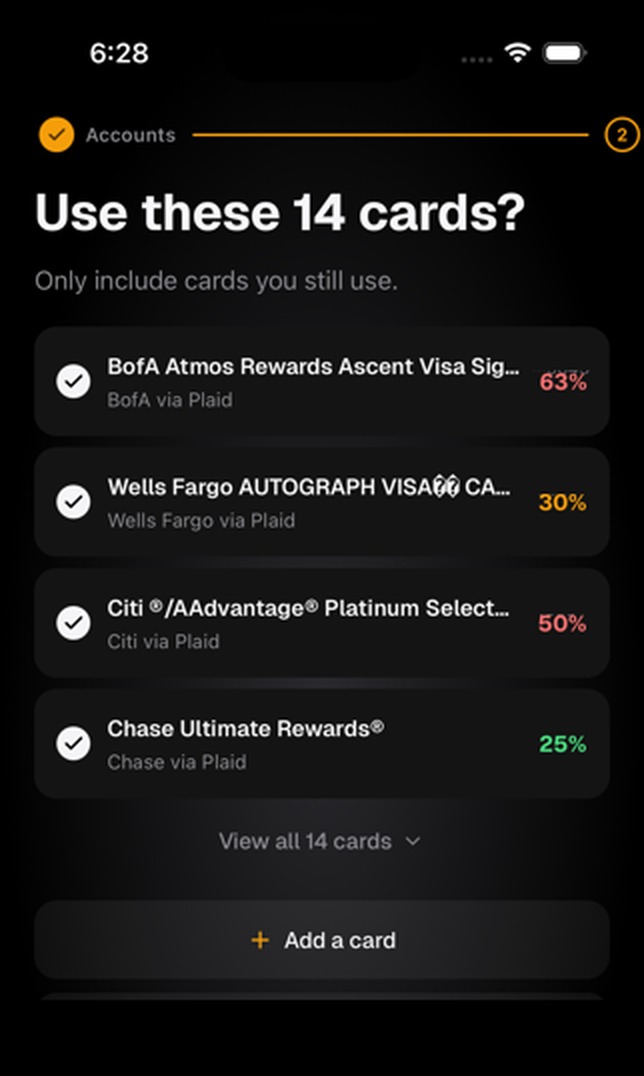
The first onboarding flow asked for everything up front and took twelve screens. I cut it to seven by asking only for what the first answer needs, and grouping setup into three plain steps: banks in, cards confirmed, a pace you can keep.
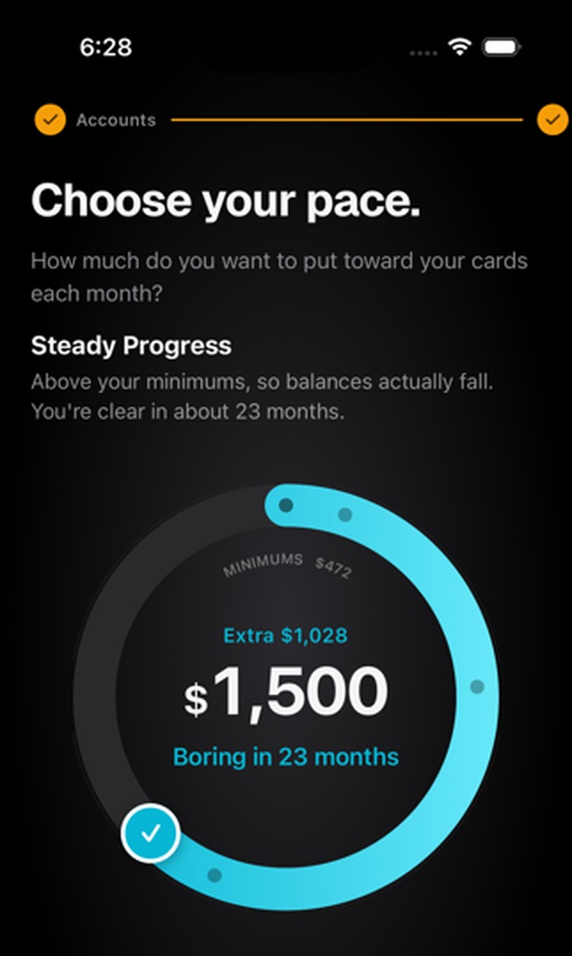
The pace step is the one I'm proudest of. Paying down debt usually feels like a punishment with no end date. The dial turns it into a choice with a finish line: pick how much goes to your cards each month and it tells you when you'll be "boring", in months, not in interest maths.
An honest paywall. No fake loader.
Money apps lose people the moment they feel tricked. So two rules shaped the business side of the product as much as the design:
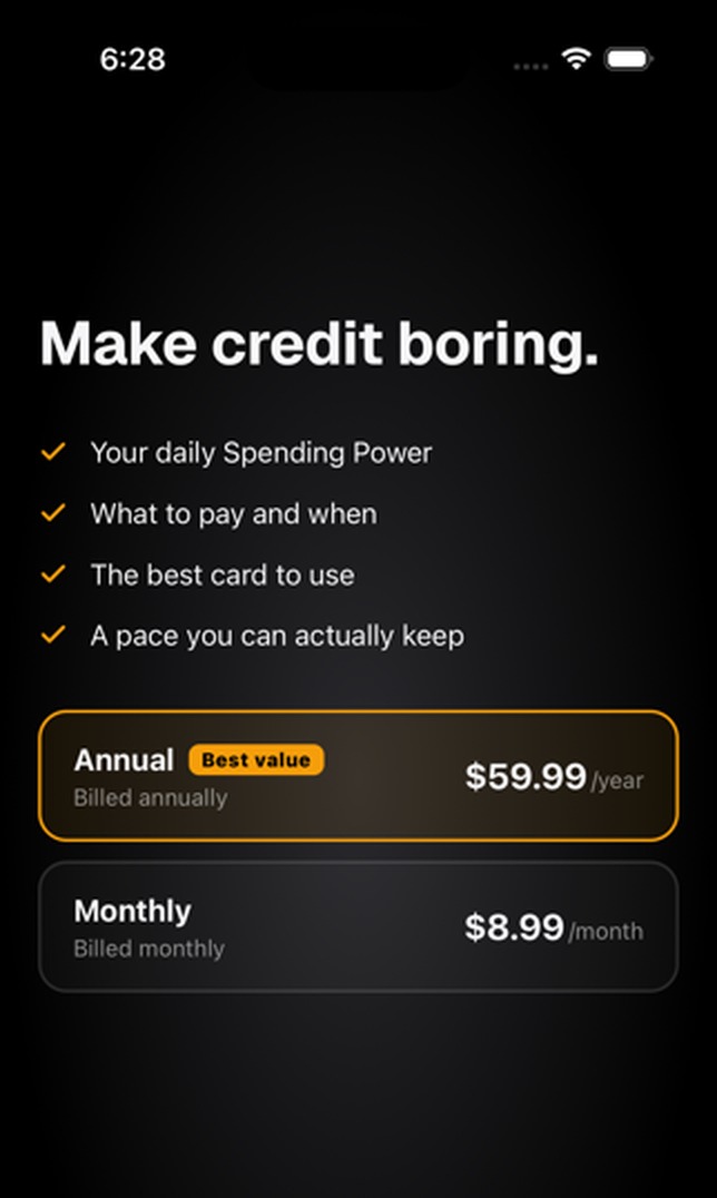
- The trial is up front, and the renewal price sits right under it. No small print, no surprise in month two.
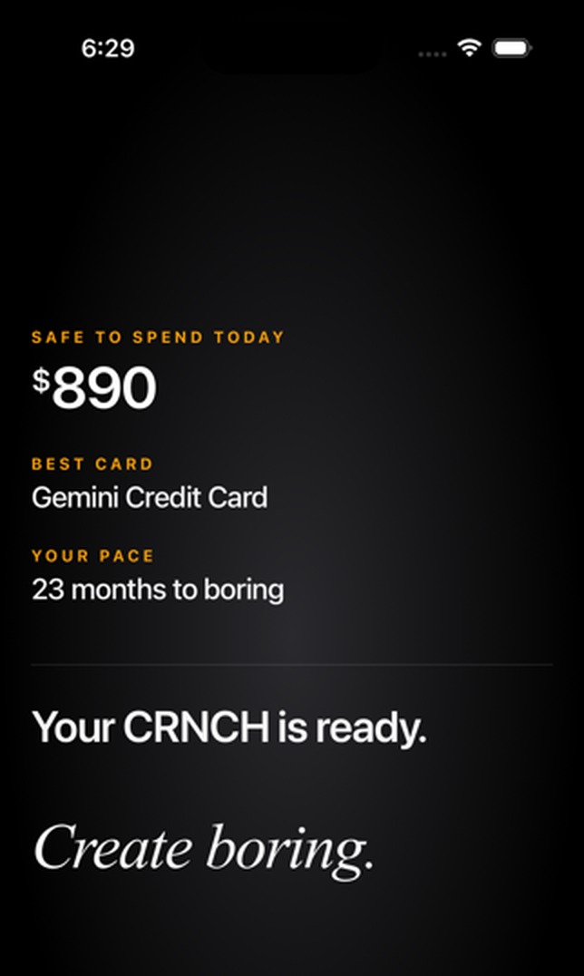
- Real numbers, no theatre. When setup finishes, the app shows your actual results straight away instead of a "crunching your numbers" animation pretending to work.
It's the same thread that runs through my AI work: show your working, say what you know, and don't perform confidence you haven't earned.
Three rings that never agree. Until it's handled.
I wanted a mark that behaves like the product. Three rings drift out of line when something changes, adjust, and then lock together. It reads as calm under pressure, which is the whole promise, and it gives the app a motion language for loading, success and alerts without inventing a new animation each time.
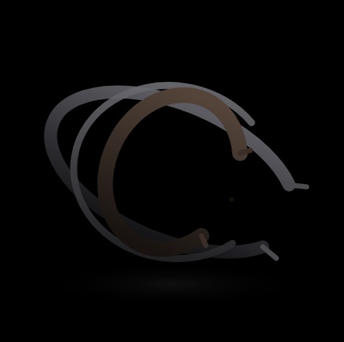 01 · Dormant
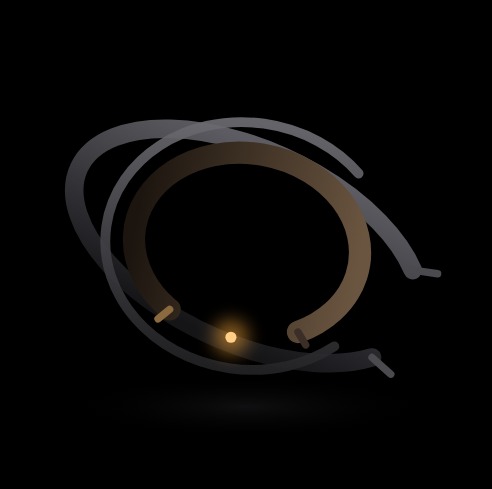 02 · Disrupted
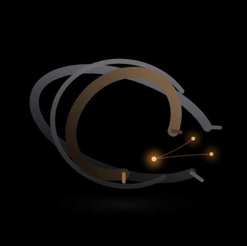 03 · Adjusting
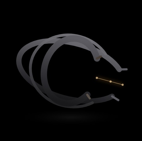 04 · Locked
One designer, a design system, and AI agents that stay inside it.
I built CRNCH in React Native myself, with AI coding agents doing much of the typing under my direction. The design system came first: tokens, type, spacing and a small set of components, so the agents were composing from approved parts instead of inventing new ones on every screen.
It's the same lesson as my governance work, at founder scale. AI makes building fast. The system is what keeps fast from turning into messy, and design judgement is what decides whether the result is any good.
[NEED: roughly how long from first commit to App Store, and one thing building it yourself let you do that a Figma handoff wouldn't have.]
From idea to a paid product people can download.
- Live on the App Store. [NEED: App Store link]
- Onboarding cut from twelve screens to seven.
- Product, brand, design system and code from one person.
- [NEED: any one rounded number: downloads, rating, trial to paid, or retention]
[NEED: one line on what's next. The relaunch, and what you're changing.]